Unleash Your Inner Type Maestro font selection + combinations
Typeface selection is perhaps the single most time-consuming, and sometimes frustrating, task you’ll face as a designer when starting a new brand development project, especially when you are in search of the perfect font pair. But, it can also be fun if you love typography the way we do at The James Agency. Even after years of experience, research and sifting through thousands of typefaces, it can still be overwhelming, so creating a system to expedite the process is key. In this article we have defined the steps that we use for font selection and pairing.
Step 1: Research
The last thing you want is to select the same typeface used in a competitor’s campaign.
TIP: Take screenshots and place these in your working folder. This can help later when presenting the project and also helps with the color exploration phase.
Step 2: Define the mood of the brand
The mood of a typeface is an important part of how it should be used. Write down some keywords that come to mind for a specific font. Typefaces can create completely different vibes, especially when paired with design choices like composition, textures, photography, color, and application of type. This is where the brand really starts to become defined, so don’t be afraid to break some rules and be unconventional in the beginning phases—life is too short for the usual and expected.
TIP: Think about the primary typeface at this point, but in the back of your mind note some complementary typefaces.
Step 3: Start searching
Using FontExplorer or preferred font management software, create a Smart Set of potential font candidates that meet the criteria listed above.
TIP: At TJA we’ve found that organizing fonts by Foundry, as the starting point to a clean library, seems to work best. Oftentimes foundries have a typographic style, have matching font styles/pairing/families, and are the best quality fonts from a character set perspective. Don’t forget to create sets as you go, such as Favorite Sans Serifs, Serifs, Slabs, Handwritten, Scripts, etc. It doesn’t need to happen overnight but, pay attention to this when browsing and you’ll be organized in no time. You’ll be amazed at your ability when you play the ‘’name-dat-font’ game with your nerdy design colleagues at lunch.
Step 4: Create a contact sheet
This will allow you to see how the fonts you’ve chosen look next to one another. They key here is to make sure the fonts balance each other out. Be inspired by everything around you and when designing for a specific industry think of dichotomies or contrasting elements as a starting point. A chef who pairs oysters and kiwi, a hip-hop producer who uses drums and samples from kung-fu classics, an interior designer who mixes vintage textiles with modern touches. These are all examples of items that shouldn’t work, but they do. Eventually you will find your own methods through research and experimentation.
TIP 1: Mix typefaces with complimentary moods to find a balance.
Tough & sweet, hard & soft, elegant & Miley Cyrus
TIP 2: Mix typefaces with different features.
Condensed vs slab serif
TIP 3: Mix typefaces with different visual textures.
Light vs dramatic
TIP 4: Mix typefaces with similar proportions but with defined roles.
Headline vs subhead vs body copy
HINT: Try changing the roles you give specific fonts when establishing a hierarchy—this can drastically change the design and mood. Also, not all brands need two or three different typefaces—sometimes one is all you need.
Step 5: Narrow your selection
Start narrowing down your selection by placing a star next to your favorites. You’ve already made some good decisions up to this point, so you will need to start limiting yourself to 3–5 top players to present to your client.
TIP: At this point, you can experiment with tracking, weights, scale.
Ultimately, the primary goal of any successful combination of typefaces not only makes your content easy to read but also helps you connect the message to your audience on all levels. Let the personality of your brand shine through every design decision.

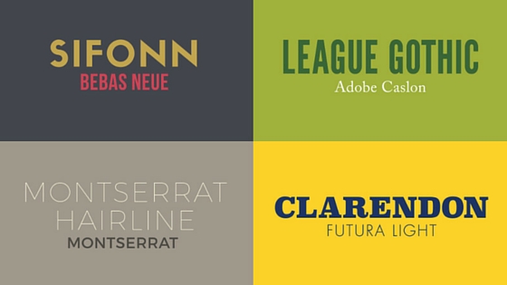
Download Fonts Here: Sifonn | Bebas Neue | League Gothic | Adobe Caslon | Montserrat Hairline | Montserrat | Clarendon | Futura Light | Bodoni | Gotham | Raleway | Droid Serif | ITC Conduit | Minion | Source Sans | Sansa | Bodoni Poster | Alto Pro Mono | Franklin Gothic | Plantin
References:
Four Techniques for Combining Fonts